The Dashboard Performance Indicator Charts use a combination of charts and graphs to represent data for the selected period or other filters.
Data Detail Charts
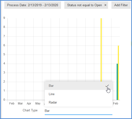
These charts display on the left of the chart widget and show the specific data details. To set the chart style, select it from the Chart Type field below the graph.
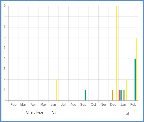
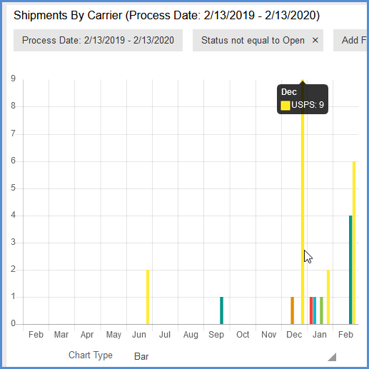
Bar Graph Chart
The bar graph presents bars on an x-y axis, clustered in groups of more than one.
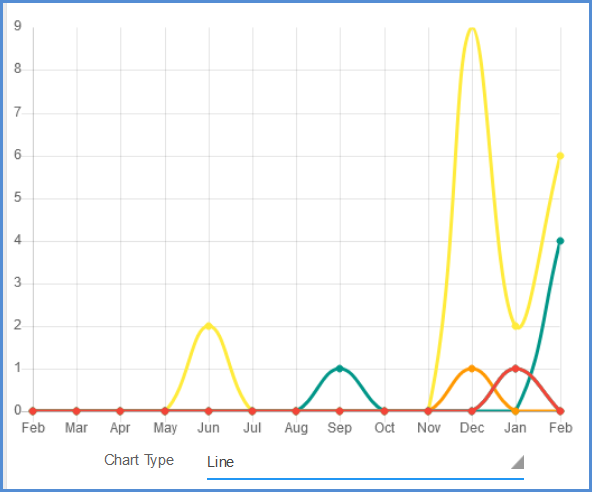
Line Chart
You can also select to display data in a line chart, which displays data as a series of data points connected by straight segments. Line charts allow you to visualize a trend in data over intervals of time.
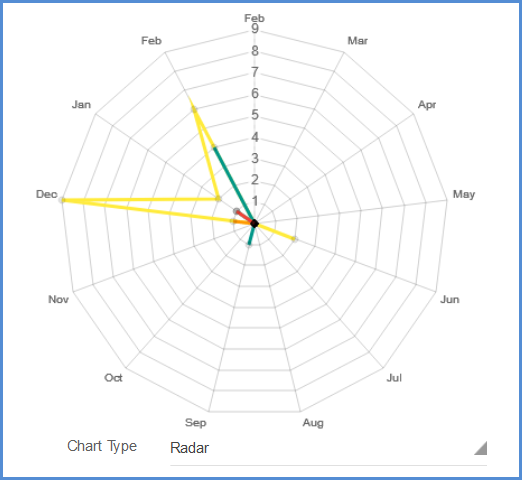
Radar Chart
A radar chart is a way of showing multiple data points and the variation between them. You can use them to compare the points of two or more different data sets, such as ship dates, carrier, etc., depending upon the chart. An axis is given for each variable, and these axes are arranged radially around a central point.
Comparison Charts
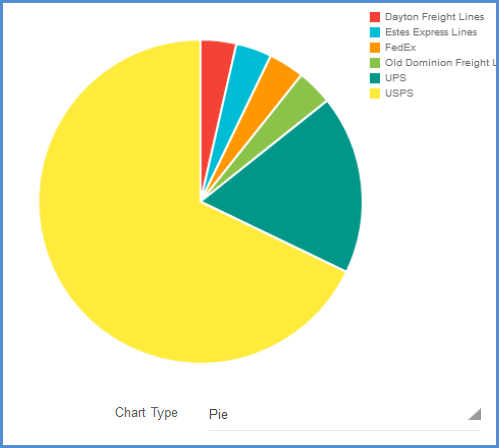
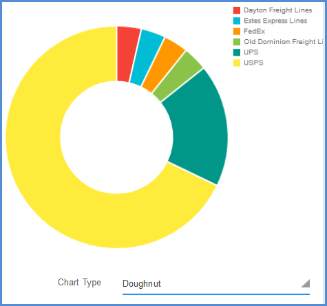
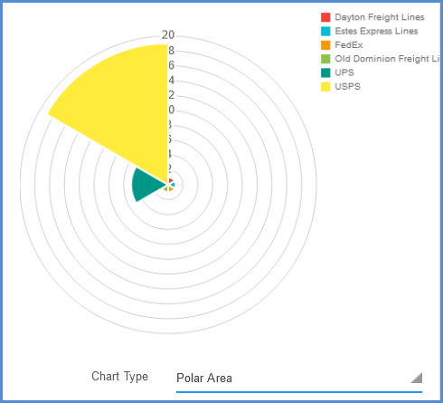
The comparison charts display on the right side of the chart widget and show the proportion of each data element, with each “slice” representing a quantity.
You can select to display the comparison information in pie, doughnut, or polar area charts using the Chart Type field below the chart.
Pie and doughnut charts are functionally the same, where a circle is divided into sections representing a proportion of the whole, with the exception of the doughnut chart having a blank center. The polar area chart is similar to the pie and doughnut charts, except that sections differ in how far each one extends from the center of the circle. The polar area chart can be used to plot cyclic data.
Chart Tips
Hover over a an area to see the data it represents.
Double-click on a section of the graph to launch a view of the associated shipments. You can then click on the magnifying glass in a shipment’s row to view the shipment detail in the Shipment Editor.

